homedecor Interior
From Abruzzo to the World
choose the COLOR BLEND
Create your Lifestyle
Color gives style to an environment; choosing it means taking into account all the design and decoration elements that characterize it, such as furniture, floors, paintings, and textiles.
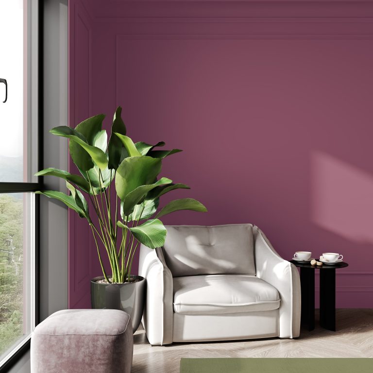
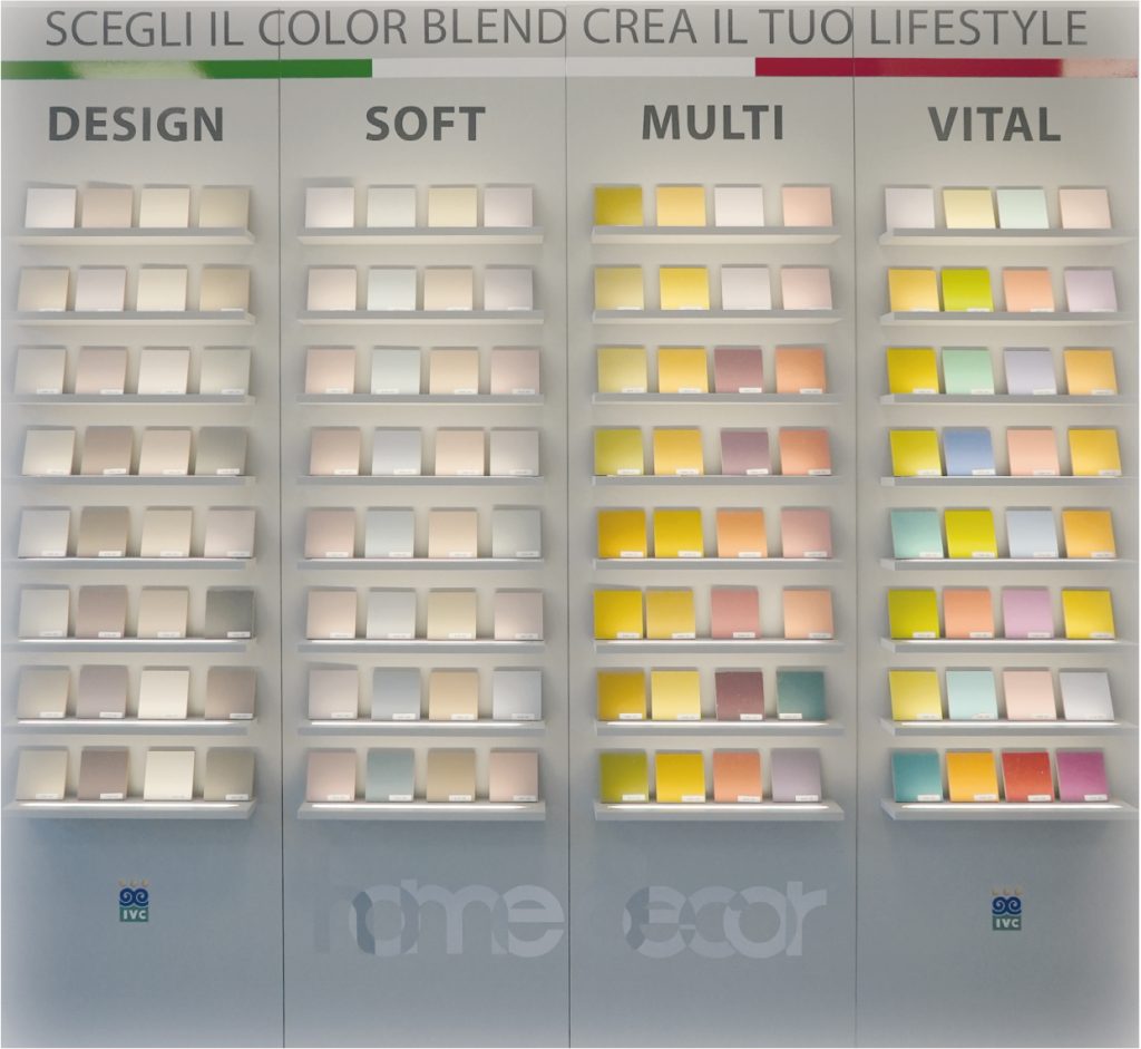
In general, it is important for there to be harmony between the colors to refine and enhance the furnishing elements. With the homedecor palette, it will be easy and intuitive to navigate the multitude of colors thanks to the four color families identified by our Color Designers: Design, Soft, Multi, and Vital.
Finally, it will be possible to "blend" without fear of making mistakes; just follow the simple steps indicated in the brochure and rely on the selections to have fun and discover, with a little imagination, how simple and intuitive it is to play with colors... so make room for creativity in search of your style!

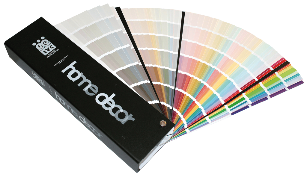
A chromatic range of 938 colors
Extra-large color swatches 7.36 cm.
Hard cover elegant and ultra-resistant.
4 color sections selected according to the most
current Color Design criteria.
Point-of-sale visual merchandising system with 128 colors created with real application.
The homedecor blends can be extended by drawing from the chromatic ranges of decorative materials.
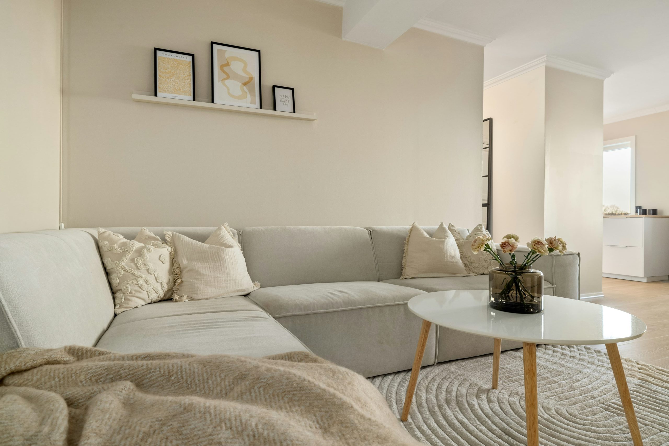

The modern touch of white.
The personality of greys and dove greys.
Pure, fresh, and clean, when chosen intentionally, white creates an imposing and modern atmosphere, giving space to rooms and an allure of timeless elegance.
Grey can be an excellent support on a decorative level; tones vary from a subtly luminous white to cool blue, through to warm shades of dove grey.
Using the right shade of grey will allow the surrounding colors to emerge in brightness and glamour.
DESIGN
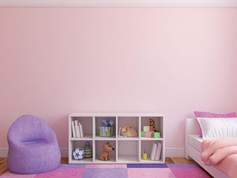
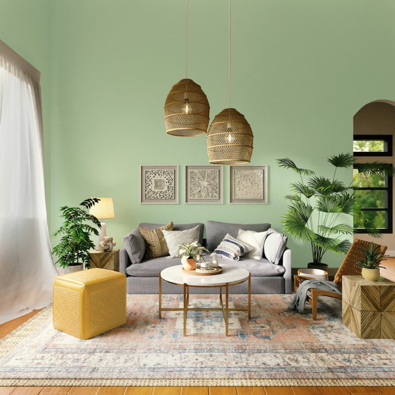
Serene and welcoming atmospheres
with pastel colors.
Pure, fresh, and clean, when chosen intentionally, white creates an imposing and modern atmosphere, giving space to rooms and an allure of timeless elegance.
Grey can be an excellent support on a decorative level; tones vary from a subtly luminous white to cool blue, through to warm shades of dove grey.
Using the right shade of grey will allow the surrounding colors to emerge in brightness and glamour.
SOFT
Neutral colors to rebalance a seemingly casual atmosphere
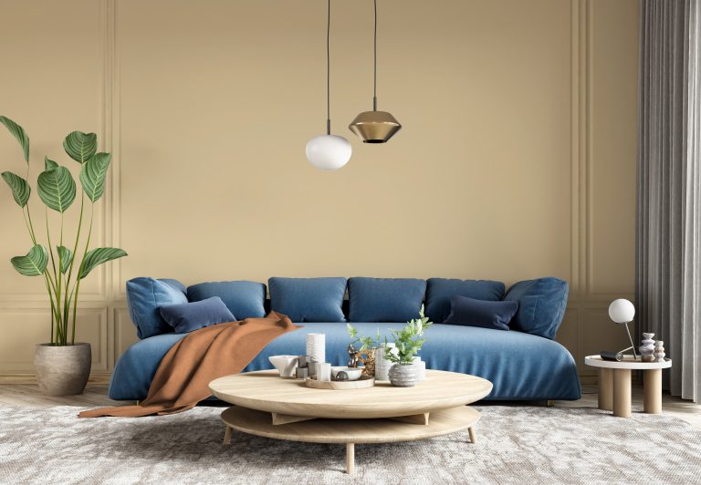
A creative and eclectic palette, composed of warm and bold colors.
Multicolor furniture and fabrics can be mixed without worrying too much about combinations; neutral beige tones can be used as a connecting anchor, and it is possible to balance the color palette with more neutral shades.
Creativity is a personal expression and there are no specific ways to achieve this style; vibration and contrast are the right ingredients for daring!
MULTI
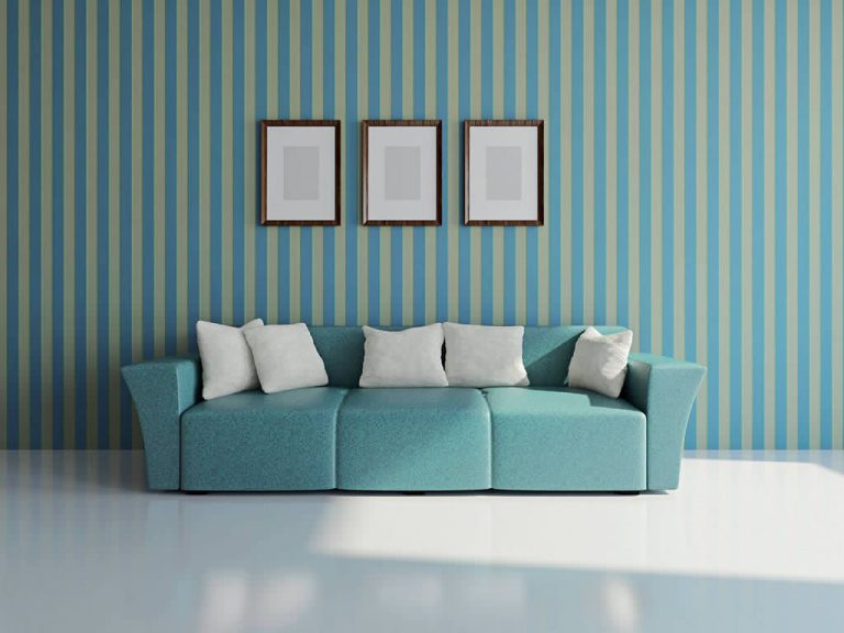
Dynamism and freshness for
technical and modern environments
The Vital style is modern, playful, cheerful, and energetic. Ideal for a fresh and dynamic environment that is not overly decorative, it pairs well with geometric textures and lacquered surfaces.
All elements of this style have a decorative purpose and adapt well to technological or industrial-trend elements.
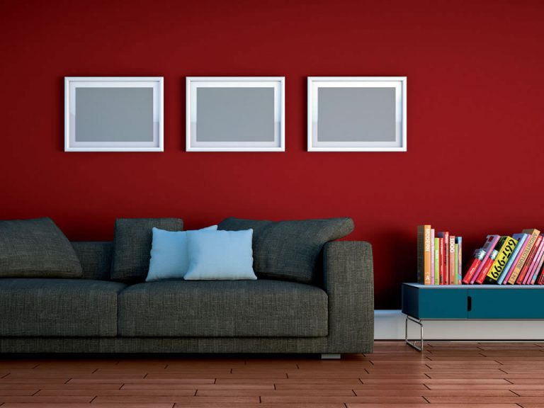
The Vital palette plays with primary colors to bring energy and joy to environments; reds, yellows, oranges, greens, and blues can be used as long as the shades are full, luminous, and bright.
In such cases, however, it is advisable to mix colors with neutral elements such as furniture or fabrics to lighten the atmosphere and emphasize the surfaces.
VITAL